 An Android phone or tablet, whether it runs stock Android or more likely a customized skin from the manufacturer, has a default launcher that determines how the home screen looks and works. For instance, Samsung’s Android skin is called TouchWiz, and HTC’s is Sense. The launcher gives you a way to organize your apps and widgets. You can replace your Android device’s launcher with one from the Google Play store.
I ran across a YouTube video “The Best Android Launcher of 2016?” which describes ten different launchers. You might prefer one of the others, but the first one mentioned, Smart Launcher, caught my eye. There is a free version and a paid version, Smart Launcher Pro.
To understand where I’m coming from, you should know that I have an iPhone and iPad, and a Samsung Galaxy Tab S2 NOOK tablet. The iPhone and iPad have app icons arranged in rows on multiple home screens, with no gaps between the first and last app on each home screen. You can drop one app icon on another to create a folder and then add more apps to that folder, thus packing more icons into fewer home screens. You can move the app icons around to your liking, and when you move one to a spot on the home screen, it shoves the one previously in that spot, and all others following, to the right, to the next row, or to the next screen as space requires. Although iOS has widgets—small windows of information associated with some apps—it doesn’t allow them on the home screens, but does allow them to be added to the notification and lock screens.
Samsung’s TouchWiz does allow widgets on the home screens, and app icons can fill the remaining space in a grid pattern. Unlike iOS, you can leave empty spots in the grid. When you move an icon to a spot that’s already taken, it will shove the existing icon out of the way to some other spot, and it may disturb another icon or two, but otherwise the other icons on that screen don’t flow nicely in a predictable manner. You don’t have to fit all your apps on the home screens, since there is an Apps list icon that opens to another set of screens with all your app icons, in a grid with no empty spots, on as many screens as are required to hold all your apps. I never found an arrangement of the main home screens that was particularly pleasing or made me feel especially well-organized.
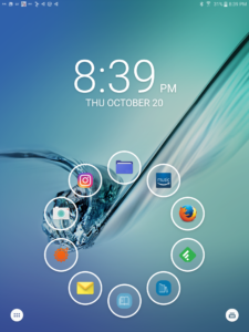
I downloaded the free version of Smart Launcher from the Play store. It provides a single QuickStart home screen with a ring of “bubble” app launchers (the “flower” arrangement), or you can choose a two-row grid layout. You can also specify a different app to launch with a double-click of a button. The “drawer” button in the lower left corner of the screen gets you to all your other apps. There are predefined categories of Communication, Internet, Games, Media, Utility, and Settings. It does a nice job of categorizing all your apps into those categories, listing the apps in alphabetical order within category. To me this made things much more manageable. Only in a few cases did I need to reassign an icon to a different category. The category icons are in a column on the left of the screen, making it easy to switch categories and find another app to launch.
There is no widget support in the free version. For that you need the Pro version. You can upgrade directly from the free version. You’ll then be able to launch widgets from the QuickStart buttons, and will get additional home screens on which you can arrange your favorite widgets. You’ll also get 19 or so additional categories to choose from, plus the ability to create your own custom category. For example, from the large Media category you can split off one or more of the Photography, Reading, Music, and Entertainment categories. When you add one of the new categories, the relevant apps are moved from their prior category. I did decide to upgrade, and I feel better organized and efficient in accessing my apps.
